Tabs Studio Blog (organizing Visual Studio document tabs)

November 19, 2010

Grouping regex snippets

Filed under: Uncategorized — Sergey Vlasov @ 12:00 pm

I’ve added several sample regular expressions for Title grouping regex and Path grouping regex that you can select from the new drop-down button menu:

Title grouping snippets

Title grouping snippets


Path grouping snippets

Path grouping snippets


Most snippets are added as an additional OR expression to the beginning of the corresponding regex, except Revert to default and Group all directories that replace the regex. Class is just a placeholder in title snippet names – corresponding regex will work for any class name. Same with Dir and Subdir in path snippet names.

For example, here is the effect of adding all 3 available Title grouping regex snippets on tabs grouping:

Default grouping

Default grouping


All Class tabs grouped together and Designer.cs in a separate tab

All Class tabs grouped together and Designer.cs in a separate tab

November 18, 2010

Updating a style from add-ins

Filed under: Uncategorized — Tags: , — Sergey Vlasov @ 11:09 am

Continuing work on reducing necessity to manually craft a XAML style, I’ve added the ability to update a style from an add-in. For example, previously for SingleRow and Shaper add-ins you needed to copy sample styles from documentation and to use them together you needed to merge these styles. Newly updated SingleRow and Shaper programmatically apply default styles not cluttering the custom style:

Default SingleRow and Shaper styles

Default SingleRow and Shaper styles


The only thing missing from the sample Chrome style for Shaper is the grey line under the tabs, as currently only setters and triggers can be automatically merged, not control templates. To make it perfect, the following custom style can be used:

<Style TargetType="TabsStudio:TabsHost" BasedOn="{StaticResource DefaultTabsHostStyle}">
  <Setter Property="Template">
    <Setter.Value>
      <ControlTemplate TargetType="{x:Type TabsStudio:TabsHost}">
       <StackPanel>  
        <Grid Panel.ZIndex="1">
          <Rectangle Width="{TemplateBinding Width}"
                     Height="{TemplateBinding Height}"
                     Fill="{TemplateBinding Background}"/>
          <Grid>
            <Grid.ColumnDefinitions>
              <ColumnDefinition Width="*"/>
              <ColumnDefinition Width="Auto"/>
            </Grid.ColumnDefinitions>
            <ContentPresenter Grid.Column="0"/>
            <TabsStudioSingleRow:HiddenTabs Grid.Column="1" TabsPanel="{TemplateBinding ContentControl.Content}"/>
          </Grid>
        </Grid>
      <Border Height="1" Background="#93979D"/>
      </StackPanel>
      </ControlTemplate>
    </Setter.Value>
  </Setter>
</Style>
The manually merged TabsHost style for SingleRow and Shaper

The manually merged TabsHost style for SingleRow and Shaper

Internally, the void UpdatePresentationStyles(string key, Presentation presentation) method was added to the TabsStudioExt.ITabsStudioEngine interface. It is possible to update styles dynamically, but right now SingleRow and Shaper do it only once in the OnConnection handler.

Triggers and setters for default Tabs Studio controls are added to the Styles property. For new controls (like TabsStudioSingleRow:HiddenTabs) a style resource and a default style usage are provided in the Presentation constructor:

private void UpdatePresentationStyle()
{
    TabsStudioExt.Presentation presentation = new TabsStudioExt.Presentation(
        LoadString("HiddenTabsStyle.xml"), LoadString("HiddenTabsUsage.xml"));
    {
        TabsStudioExt.PresentationStyle style = new TabsStudioExt.PresentationStyle();
        style.Triggers.Add(LoadString("TabTriggers.xml"));
        presentation.Styles.Add("TabsStudio:Tab", style);
    }
    {
        TabsStudioExt.PresentationStyle style = new TabsStudioExt.PresentationStyle();
        style.Setters.Add(LoadString("TabsHostTemplate.xml"));
        presentation.Styles.Add("TabsStudio:TabsHost", style);
    }
    engine.UpdatePresentationStyles("SingleRow", presentation);
}

The style parameter in the Presentation constructor can also add static resources for use in tab coloring rules. Theoretically it may be a custom brush or a generated color. These changes are included in the upcoming Tabs Studio release.

November 15, 2010

Tabs Studio v2.1.7 released

Filed under: Releases — Sergey Vlasov @ 2:20 pm

Tabs Studio v2.1.7 released – added the Paths tab property, added Document paths regex and Custom conditions options to the Tab Coloring Rule dialog, fixed unescaped back slashes in regex tab coloring rules.

More tab coloring options

Filed under: Uncategorized — Tags: — Sergey Vlasov @ 12:00 pm

I’ve added Document paths regex and Custom conditions options to the Tab Coloring Rule dialog:

The Tab Coloring Rule dialog with new options

The Tab Coloring Rule dialog with new options

Document paths regex uses the newly added Paths tab item property consisting of document paths ending with ‘$’. For a tab “App .xaml .xaml.cs” Paths is something like “c:\Projects\WpfApplication1\app.xaml$c:\Projects\WpfApplication1\app.xaml.cs$”. If you want to set a color for all xaml and xaml.cs tabs, Document paths regex could be the following expression:

\.(xaml|xaml\.cs)\$

The Custom conditions option allows you to switch on tab item properties not listed in this dialog. For example, the MVCGroup add-in adds IsController and IsView attached tab properties. To color controller tabs you can use the following custom condition:

<Condition Binding="{Binding Path=(TabsStudioMvcGroup:Properties.IsController),
  RelativeSource={RelativeSource Self}}" Value="True"/>

Another example is for the case when you want to change the color of a tab in Visual Studio 2010 when tabs are not focused:

<Condition Binding="{Binding Path=IsGroupFocused, RelativeSource={RelativeSource Self}}" Value="False"/>

Download link: TabsStudio v2.1.7.

November 13, 2010

A color picker and a toolbar for AvalonStyleEditor

Filed under: Uncategorized — Tags: , — Sergey Vlasov @ 10:13 pm

I’ve added the ColorComb based color picker to the AvalonStyleEditor add-in:

Color Picker dialog in Tabs Studio

Color Picker dialog in Tabs Studio


When you open the color picker dialog, a color under the caret is loaded as the current color. After you select a new color in the dialog it overwrites the old color in the style editor. You can open the color picker from the editor toolbar and with the Ctrl+P keyboard shortcut.

I’ve also added the toolbar to the style editor that is present both on the Style page and in the Tab Coloring Rule dialog:

The editor toolbar on the Style page

The editor toolbar on the Style page


Download link: AvalonStyleEditor v1.0.1.

November 12, 2010

Color picker

Filed under: Uncategorized — Sergey Vlasov @ 2:56 pm

I selected a color picker for a style editor in Tabs Studio and here is a list of most interesting open source WPF dialog based color pickers that I found (not commercial and not drop-down color picker controls).

Windows common color dialog

First of all there is the common Windows color dialog. Providing consistent user experience since 1990:

Edit Colors dialog in Windows 7

Edit Colors dialog in Windows 7


Color selector dialogs in Windows 3.1

Color selector dialogs in Windows 3.1

Simple WPF Color Picker by Sacha Barber

Sacha Barber wrote the CodeProject article about his WPF color picker and later Mark Treadwell did various enhancements on this code. Still color position is not preserved when switching swatches, colors range on swatches is limited and there are no additional controls to tune color other than transparency.

WPF Color Picker by Sacha Barber and Mark Treadwell

WPF Color Picker by Sacha Barber and Mark Treadwell

Color Picker Custom Control from Windows SDK

You can find it in the “c:\Program Files\Microsoft SDKs\Windows\v7.0\Samples\WPFSamples.zip” archive on your machine and read about it in the Uncommon Dialogs: Font Chooser & Color Picker Dialogs blog post. Functional, but requires more polishing for practical use.

WPF Color Picker Custom Control sample from Windows SDK

WPF Color Picker Custom Control sample from Windows SDK

Color Picker from SharpDevelop

Open source SharpDevelop IDE contains a color picker with a nice conventional design.

Color Picker from SharpDevelop

Color Picker from SharpDevelop

ColorComb by Shawn A. Van Ness

Shawn A. Van Ness developed the ColorComb color-picker dialog with the ability to adjust stylus stroke properties. It is very easy to select a color you have in mind looking at the comb and use the brightness slider for fine tuning. Cells in the comb provide palette like qualities allowing to choose a distinctive collection of colors. Lack of HSV and RGB controls ensures less distraction when selecting a color.

ColorComb by Shawn A. Van Ness

ColorComb by Shawn A. Van Ness

ColoRotate

ColoRotate is an online service allowing you to select colors in 3D. It positions itself as the most intuitive way to work with colors “in a way that matches how our minds process color.” The site has an interactive demonstration showing how “our visual nerves register color in terms of the attributes of color: the amount of green-or-red; the amount of blue-or-yellow; and the brightness.”

ColoRotate browser

ColoRotate browser

Colors dialog in Microsoft Office 2007

Colors dialog in Office 2007 has a design very similar to ColorComb plus it has comparison between a new and the current colors.

Colors dialog in Microsoft Office 2007

Colors dialog in Microsoft Office 2007

ColorComb simplified

To be a part of a XAML editor in Tabs Studio, I liked ColorComb most. I removed ink-specific settings from the dialog and added the current color for comparison.

ColorComb without ink-specific settings

ColorComb without ink-specific settings


If you want to use this ColorComb modification in your application, following is the download link: ColorPickerSampleSV.zip.


Organize Visual Studio tabs with Tabs Studio add-in

November 6, 2010

Tabs Studio v2.1.6 released

Filed under: Releases — Sergey Vlasov @ 5:04 pm

Tabs Studio v2.1.6 released:

  • Added tab coloring parameters and the Set color context menu command.
  • Added TabName and ProjectName tab item properties.
  • Added RegexMatch converter to default style resources.
  • Replaced the Quick Style dialog with Presentation options.
  • Changed DefaultTabExtensionCloseButton style key to DefaultTabExtensionCloseButtonStyle.
  • Deleted Projector from prepackaged add-ins.

Tab coloring simplified

Filed under: Uncategorized — Tags: — Sergey Vlasov @ 4:37 pm

Trying to reduce necessity to manually craft a XAML style, I’ve added presentation parameters and tab coloring rules to Tabs Studio. While a custom XAML style allows seamless integration of different visual adornments together, it takes some time to make it right. Presentation parameters are a new layer between a default style and a custom style. It implements most common style options thus simplifying a custom XAML style.

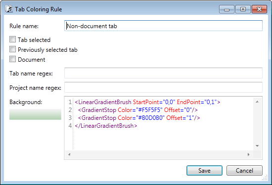
Presentation is a new tab in Tabs Studio options and it replaces the Quick Style dialog. Font size, Close tab button style and Animation are now presentation options instead of a part of Quick Style generated style. Selected tab style, Previously selected tab and Non-document tab options from the old Quick Style dialog can now be represented as tab coloring rules:

Presentation parameters

Presentation parameters


Selected tab style XP rule

Selected tab style XP rule


Previously selected tab rule
Previously selected tab rule


Non-document tab rule

Non-document tab rule

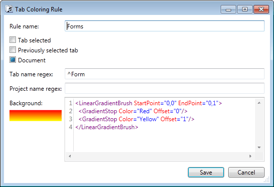
A tab coloring rule has 5 filtering options and a definition for a tab background brush. Checked boolean options apply the rule to tabs with the corresponding property set to True (e.g. IsTabSelected), unchecked – to False and undefined – to all tabs. Regular expression options apply Regex.IsMatch with the corresponding property (e.g. TabName) when the regex is not empty (see Regular Expression Language Elements MSDN page for .NET regular expressions details).

Two more examples. The Forms rule applies to tabs with the name starting from Form when this tab is not selected and not previously selected. The WindowsFormsApplication1 project rule applies when tab’s project name contains WindowsFormsApplication1 and tab name doesn’t start from Form.
Forms rule

Forms rule


WindowsFormsApplication1 project rule

WindowsFormsApplication1 project rule

Tab background definition must be a Brush descendant. Different options to specify a color in XAML are listed on the Color documentation page.

Everything that presentation parameters do can be achieved in a XAML style. For example, the following style is equivalent to what a tab coloring rule generates internally:

<Style TargetType="TabsStudio:Tab" BasedOn="{StaticResource DefaultTabStyle}">
    <Style.Triggers>
        <MultiDataTrigger>
            <MultiDataTrigger.Conditions>
                <Condition Binding="{Binding Path=IsTabSelected, RelativeSource={RelativeSource Self}}" Value="False"/>
                <Condition Binding="{Binding Path=IsPreviouslySelectedTab, RelativeSource={RelativeSource Self}}" Value="False"/>
                <Condition Binding="{Binding Path=IsDocument, RelativeSource={RelativeSource Self}}" Value="True"/>
                <Condition Binding="{Binding Path=TabName, RelativeSource={RelativeSource Self}, 
                		Converter={StaticResource RegexMatch},ConverterParameter='^Class'}" Value="True"/>
                <Condition Binding="{Binding Path=ProjectName, RelativeSource={RelativeSource Self}, 
                		Converter={StaticResource RegexMatch},ConverterParameter='^Windows'}" Value="True"/>
            </MultiDataTrigger.Conditions>
            <Setter Property="Background">
                <Setter.Value>
                     <SolidColorBrush Color="Red"/>
                </Setter.Value>
            </Setter>  
        </MultiDataTrigger>
    </Style.Triggers>
</Style>

There is one more convenience feature to set tab color. On the right click context menu there is now the Set color… command:

Set color context menu command

Set color context menu command

When adding a new rule using this command the options are pre-populated with the tab item parameters and when a matching rule(s) already exists then the Set Color choice dialog is presented:
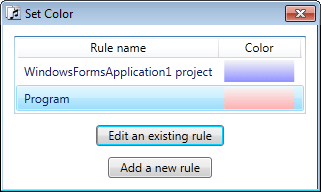
Set color choce dialog

Set color choce dialog

Download link: TabsStudio v2.1.6.

October 24, 2010

Using AvalonEdit as a style editor in Tabs Studio

Filed under: Uncategorized — Tags: — Sergey Vlasov @ 1:25 pm

Tabs Studio v2.1.5 makes possible to customize the style editor and the new AvalonStyleEditor add-in uses the AvalonEdit editor from the SharpDevelop IDE for style editing in Tabs Studio:

AvalonEdit style editor in Tabs Studio

AvalonEdit style editor in Tabs Studio

Out of the box AvalonEdit supports XML syntax highlighting, line numbers and block indent (select several lines and press Tab of Shift+Tab). I’ve also added the Ctrl+OemQuestion keyboard shortcut to comment and uncomment selected text.

AvalonEdit is easily extensible – more features like code completion and folding can be added later. Or completely different style editor control can be added to Tabs Studio in a separate add-in.

Download link: AvalonStyleEditor v1.0.0.

Tabs Studio v2.1.5 released

Filed under: Releases — Sergey Vlasov @ 10:05 am

Tabs Studio v2.1.5 released:

  • Added tab activation when dragging text over the tab header.
  • Added automatic Tabs Studio restart after saving changes in the Add-in Manager dialog.
  • Added ability to customize the style editor in Tabs Studio.
  • Added maximized window state and selected tab restoring when reopening the Options dialog.
  • Added support for PowerBuilder .NET 12.0.
  • Removed an error notification when placing a non Tabs Studio add-in dll to the add-in installation folder.
  • Fixed inability to use the tab character in the style editor.
« Newer PostsOlder Posts »

Blog at WordPress.com.