Tabs Studio Blog (organizing Visual Studio document tabs)

March 15, 2022

Highlighting tabs for the selected project

Filed under: Uncategorized — Tags: , — Sergey Vlasov @ 11:11 pm

I’ve created the new Selector add-in that dynamically highlights tabs belonging to the same project as the selected tab.

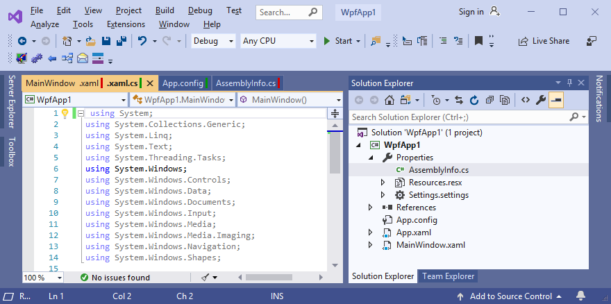
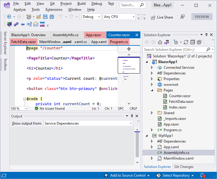
For example, when the selected tab is from the BlazorApp1 project:

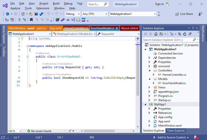
And when the selected tab is from the WpfApp1 project:

A sample tabs style setting transparent red background color for selected project tabs excluding the selected tab:

<Style TargetType="TabsStudio:Tab" BasedOn="{StaticResource DefaultTabStyle}">
    <Style.Triggers>
          <MultiDataTrigger>
            <MultiDataTrigger.Conditions>
              <Condition Binding="{Binding Path=(TabsStudioSelector:Properties.IsSelectedProject), RelativeSource={RelativeSource Self}}" Value="True" />
              <Condition Binding="{Binding Path=IsTabSelected, RelativeSource={RelativeSource Self}}" Value="False"/>
            </MultiDataTrigger.Conditions>
            <Setter Property="Background" Value="#50FF0000" />
          </MultiDataTrigger>
    </Style.Triggers>
</Style>

Download link: Selector v1.0.0.

November 18, 2021

Tabs Studio v5.1.0 released

Filed under: Releases — Tags: , — Sergey Vlasov @ 9:28 pm

Tabs Studio v5.1.0 released:

  • Added the short tabs display option.
  • Changed selected tab background color in Visual Studio 2022 dark mode.

Download link: Tabs Studio v5.1.0.

November 11, 2021

Short tabs

Filed under: Uncategorized — Tags: , — Sergey Vlasov @ 12:26 pm

In Tabs Studio, tabs expand to fill available row space (unless it is the last row of tabs). This is how it looks in VS 2022:

I’ve added the new ShortTabs property that prevents tab expansion:

You can enable it with the following style:

<Style TargetType="TabsStudio:Tabs" BasedOn="{StaticResource DefaultTabsStyle}">

  <Setter Property="ShortTabs" Value="True"/>

</Style>

Download link: Tabs Studio v5.0.2.

April 18, 2019

Customizing TrackEd colors

Filed under: Uncategorized — Tags: — Sergey Vlasov @ 9:56 am

TrackEd add-in shows a yellow or green bar in the tab title for modified and saved documents:

You can customize these colors first by applying the following Tabs style (copied from TrackEd source):

<Style TargetType="TabsStudio:TabNameModificationMarker" BasedOn="{StaticResource DefaultTabNameModificationMarkerStyle}">
<Setter Property="Template">
  <Setter.Value>
    <ControlTemplate TargetType="{x:Type TabsStudio:TabNameModificationMarker}">
      <TextBlock Name="TabNameModificationMarkerTextBlock" Padding="0" Margin="3,2,0,2"  Text=" "/>
      <ControlTemplate.Triggers>
        <DataTrigger Binding="{Binding Path=(TabsStudioTrackEd:Properties.DocStatus),
                 RelativeSource={RelativeSource AncestorType=TabsStudio:TabNameGroup}}" Value="Dirty">
          <Setter TargetName="TabNameModificationMarkerTextBlock" Property="TextBlock.Background" Value="#E5AC00"/>
          <Setter Property="Visibility" Value="Visible"/>
        </DataTrigger>
        <DataTrigger Binding="{Binding Path=(TabsStudioTrackEd:Properties.DocStatus),
                 RelativeSource={RelativeSource AncestorType=TabsStudio:TabNameGroup}}" Value="Saved">
          <Setter TargetName="TabNameModificationMarkerTextBlock" Property="TextBlock.Background" Value="#009900"/>
          <Setter Property="Visibility" Value="Visible"/>
        </DataTrigger>
      </ControlTemplate.Triggers>
    </ControlTemplate>
  </Setter.Value>
</Setter>
</Style>

<Style TargetType="TabsStudio:TabExtensionModificationMarker" BasedOn="{StaticResource DefaultTabExtensionModificationMarkerStyle}">
<Setter Property="Template">
  <Setter.Value>
    <ControlTemplate TargetType="{x:Type TabsStudio:TabExtensionModificationMarker}">
      <TextBlock Name="TabExtensionModificationMarkerTextBlock" Padding="0" Margin="0,2,0,2"  Text=" "/>
      <ControlTemplate.Triggers>
        <DataTrigger Binding="{Binding Path=(TabsStudioTrackEd:Properties.DocStatus),
                 RelativeSource={RelativeSource AncestorType=TabsStudio:TabExtensionGroup}}" Value="Dirty">
          <Setter TargetName="TabExtensionModificationMarkerTextBlock" Property="TextBlock.Background" Value="#E5AC00"/>
          <Setter Property="Visibility" Value="Visible"/>
        </DataTrigger>
        <DataTrigger Binding="{Binding Path=(TabsStudioTrackEd:Properties.DocStatus),
                 RelativeSource={RelativeSource AncestorType=TabsStudio:TabExtensionGroup}}" Value="Saved">
          <Setter TargetName="TabExtensionModificationMarkerTextBlock" Property="TextBlock.Background" Value="#009900"/>
          <Setter Property="Visibility" Value="Visible"/>
        </DataTrigger>
      </ControlTemplate.Triggers>
    </ControlTemplate>
  </Setter.Value>
</Setter>
</Style>

And then change colors for the name and extension to your values. For example, after changing default #E5AC00 Dirty color to #D90000 it looks like this:

April 10, 2019

Tab coloring rules generator

Filed under: Uncategorized — Tags: — Sergey Vlasov @ 10:07 am

The Tab coloring rule dialog lets you conveniently define background and foreground colors for a tab matching specific criteria:

The same rule can be also defined as an XAML Tabs style:

<Style TargetType="TabsStudio:Tab" BasedOn="{StaticResource DefaultTabStyle}">
    <Style.Triggers>
        <MultiDataTrigger>
            <MultiDataTrigger.Conditions>
                <Condition Binding="{Binding Path=Paths, RelativeSource={RelativeSource Self}, 
                		Converter={StaticResource RegexMatch},ConverterParameter='WpfApp1'}" Value="True"/>
                <Condition Binding="{Binding Path=IsTabSelected, RelativeSource={RelativeSource Self}}" Value="True"/>
            </MultiDataTrigger.Conditions>
            <Setter Property="Background">
                <Setter.Value>
                     <LinearGradientBrush StartPoint="0,0" EndPoint="0,1"> <GradientStop Color="#e87400" Offset="0"/> <GradientStop Color="#0089E1" Offset="1"/> </LinearGradientBrush>
                </Setter.Value>
            </Setter>  
            <Setter Property="Foreground">
                <Setter.Value>
                     <SolidColorBrush Color="White"/>
                </Setter.Value>
            </Setter>  
        </MultiDataTrigger>
    </Style.Triggers>
</Style>

If you have many similar tab coloring rules, instead of using the Tab coloring rule dialog you may consider generating an XAML style programmatically and then copy it to Tabs Studio.

TStyle.zip is a sample project for Visual Studio 2019 using a T4 Text Template that generates 3 styles for a project tab, selected project tab and previously selected project tab given a project path and a base background color. If you want to define these styles for multiple projects, in the tab.tt file just add a path-color pair to the dictionary, save the file and copy generated tab.txt file contents as Tabs style:

<# var rules = new Dictionary<string, string> { {"WebApplication1", "#800000"}, {"WpfApp1", "#e87400"} }; #>

February 6, 2019

Visual Studio 2019 inactive tab text

Filed under: Uncategorized — Tags: , — Sergey Vlasov @ 11:29 pm

Visual Studio 2019 Preview 2.2 includes an updated blue theme that makes inactive tab text in Tabs Studio invisible:

One workaround to fix it is applying the following Tabs style:

<Style TargetType="TabsStudio:Tab" BasedOn="{StaticResource DefaultTabStyle}">
  <Style.Triggers>
    <MultiTrigger>
      <MultiTrigger.Conditions>
        <Condition Property="IsGroupFocused" Value="False"/>
        <Condition Property="IsTabSelected"  Value="True"/>
      </MultiTrigger.Conditions>
      <Setter Property="Foreground" Value="{DynamicResource {x:Static vs_shell:EnvironmentColors.FileTabInactiveTextBrushKey}}"/>
    </MultiTrigger>
  </Style.Triggers>
</Style>

The fix will be included in the next Tabs Studio release.

September 17, 2012

Tab text color customization

Filed under: Uncategorized — Tags: — Sergey Vlasov @ 6:11 pm

There are 4 text elements in a tab: name, extension, name modification marker and extension modification marker. These elements are normally having the same color. Plus, in Visual Studio 2012, close tab button and open preview tab button are drawings also normally having the same color with the text elements. It is much easier to customize colors for all these elements in the new Tabs Studio version.

All elements now by default bind to the tab foreground color. Just set tab foreground color in a style and you are done:

<Style TargetType="TabsStudio:Tab" BasedOn="{StaticResource DefaultTabStyle}">
      <Setter Property="Foreground" Value="Red"/>
</Style>

As always, you can change the color for a specific element too. Plus in VS 2012 you can now change it for the close tab button and the open preview tab button:

<Style TargetType="TabsStudio:CloseTabButton" BasedOn="{StaticResource DefaultCloseTabButtonStyle}">
      <Setter Property="Foreground" Value="Blue"/>
</Style>

And now you can set tab foreground colors simply in the Tab Coloring Rule dialog depending on tab properties state:

Tab background and foreground rule setup

Tab background and foreground rule setup

You can set only background, only foreground or both colors. In the tab coloring rules list, the visible color will be background, foreground and both colors correspondingly:

Visible colors in the tab coloring rules list

Visible colors in the tab coloring rules list

Smart suggestions for tab coloring

Filed under: Uncategorized — Tags: — Sergey Vlasov @ 4:20 pm

I’ve added suggestions to the Tab Coloring Rule dialog. Each field in the dialog now has a corresponding samples button that lets you quickly define tab coloring rules:

Tab Coloring Rule dialog with suggestion buttons

Tab Coloring Rule dialog with suggestion buttons

Let me remind you, that you can start adding a tab coloring rule from two places. From the tab context menu Set color… command and from the Tabs Studio Presentation options page. In the first case the suggestions will be tailored for the tab you selected to color and in the second case all open tabs appear in the suggestions.

For example, Project name regex suggestions for the selected tab contain tab’s project:

Project name regex suggestions for the selected tab

Project name regex suggestions for the selected tab

Selecting the exact match sets the regex to ^WpfApplication1$ and selecting the Contains option sets the regex to WpfApplication1. While you rarely have other projects containing selected project name, it shows how easily you can set the regex for example to Wpf and have a distinct color for all your WPF projects.

If you opened the dialog from Tabs Studio options, all project names from all open tabs appear in the suggestions. The names are alphabetically sorted and the first name has the prebuild regex for the exact match:

Project name regex suggestions for all tabs

Project name regex suggestions for all tabs

I should clarify that while suggestions are different for one tab and all tabs, the rule created works exactly the same. All that matter is actual text in a regex filed.

Tab extensions regex suggestions show extensions from the selected tab or from all tabs:

Tab extensions regex suggestions

Tab extensions regex suggestions

Coloring by file extension can also be done using Document paths regex, but only with the tab extensions regex you can target tabs like [Design]. Selecting an extension suggestion creates a regex like \.vb \[Design]\$. All special regex characters are automatically escaped (it works for all regex fields). \$ forces exact match on extension end.

Tab name regex suggestions work like Project name regex suggestions and Document paths regex suggestions work like Tab extensions regex suggestions.

Custom conditions suggestions show most common currently available tab properties (with current values in one tab mode):

Custom conditions suggestions

Custom conditions suggestions

The list of suggestions is filtered depending on what version of Visual Studio you are running, active Tabs Studio add-ins and whether you have one or more tab groups open. Selecting a suggestion adds a condition like <ConditionX IsTabSelected=”True”/>. It is a shortened form that I use only for this text edit control. The normal form of a WPF MultiDataTrigger condition (that I restore on dialog save) is this:

<Condition Binding="{Binding Path=IsTabSelected, RelativeSource={RelativeSource Self}}" Value="True"/>

Finally, Background suggestions let you select a template for a gradient or solid color brush:

Background suggestions
Background suggestions

September 12, 2012

Visual Studio 2012 color themes support

Filed under: Uncategorized — Tags: , — Sergey Vlasov @ 4:31 pm

With the recent release of Visual Studio 2012 Color Theme Editor, in addition to the light and dark themes, you can now select from 5 more themes and even choose your own colors:

Theme selection in Visual Studio 2012

Theme selection in Visual Studio 2012

I’ve updated Tabs Studio to support custom Visual Studio 2012 colors. Instead of two hardcoded light and dark styles, Tabs Studio now uses a single VS 2012 styles collection with direct binding to current VS 2012 shell colors. Each change in Visual Studio 2012 tab colors is now immediately reflected in Tabs Studio tab colors. For example, this is how Tabs Studio looks after selecting the blue theme:

Visual Studio 2012 blue theme

Visual Studio 2012 blue theme

May 16, 2012

Short Tabs Priority

Filed under: Uncategorized — Tags: — Sergey Vlasov @ 9:32 am

The tabs layout algorithm in Tabs Studio tries to minimize number of rows, distribute tabs evenly between rows and minimize tab movements between rows as you add or remove tabs. The last goal to minimize tab movements between rows sometimes creates quite wide tabs:

Extra wide tabs in the top row

Extra wide tabs in the top row

For the new release I’ve reduced the priority of no tab movement and for the same tabs the new look is this:

More priority for shorter tabs in the new release

More priority for shorter tabs in the new release

Plus I’ve added the new ShortTabsPriority property that you can customize from a custom style. It is a double value. Value of 1 is old behavior. Default in the new release is 3. Value of 10 is a high priority and 100 is a very high priority. Following is an example that you can use to customize the tabs width/movement balance:

<Style TargetType="TabsStudio:Tabs" BasedOn="{StaticResource DefaultTabsStyle}">
  <Setter Property="ShortTabsPriority" Value="10"/>
</Style>

High priority of short tabs

High priority of short tabs

Download link: Tabs Studio v2.7.5.

Older Posts »

Blog at WordPress.com.