Tabs Studio v5.1.0 released:
- Added the short tabs display option.
- Changed selected tab background color in Visual Studio 2022 dark mode.
Download link: Tabs Studio v5.1.0.
Tabs Studio v5.1.0 released:
Download link: Tabs Studio v5.1.0.
In Tabs Studio, tabs expand to fill available row space (unless it is the last row of tabs). This is how it looks in VS 2022:
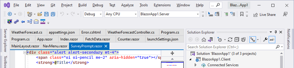
I’ve added the new ShortTabs property that prevents tab expansion:
You can enable it with the following style:
<Style TargetType="TabsStudio:Tabs" BasedOn="{StaticResource DefaultTabsStyle}">

  <Setter Property="ShortTabs" Value="True"/>

</Style>
Download link: Tabs Studio v5.0.2.
Tabs Studio v5.0.0.1 fixes EnvDTE FileNotFoundException in Visual Studio 2022 Preview 2.1.
Download link: Tabs Studio v5.0.0.1.
Tabs Studio v5.0.0 released:

Tabs Studio in Visual Studio 2022
Download link: Tabs Studio v5.0.0.
The Disambiguator add-in detects when two or more tabs have the same title and adds Visual Studio folder or project to titles for these tabs:

Notice how for WindowsProject1.h and WindowsProject1.cpp tabs it added corresponding VS folder names Header Files and Source Files and for Resource.h tabs it added corresponding project names WindowsProject2 and WindowsProject1.
Disambiguator v1.0.6 shipped with Tabs Studio v4.8.0 also had some limitations. For MainWindow.xaml.cs and MainWindow.xaml tabs that are in the same directory, folder and project it still unnecessarily adds the project name WpfApp1, and for Class1.cs tabs that are in the NewFolder1/111/Class1.cs and NewFolder2/111/Class1.cs folders it adds only the closest folder name 111.
I’ve extended Disambiguator to compare full document paths when previously demonstrated disambiguation doesn’t provide enough info:
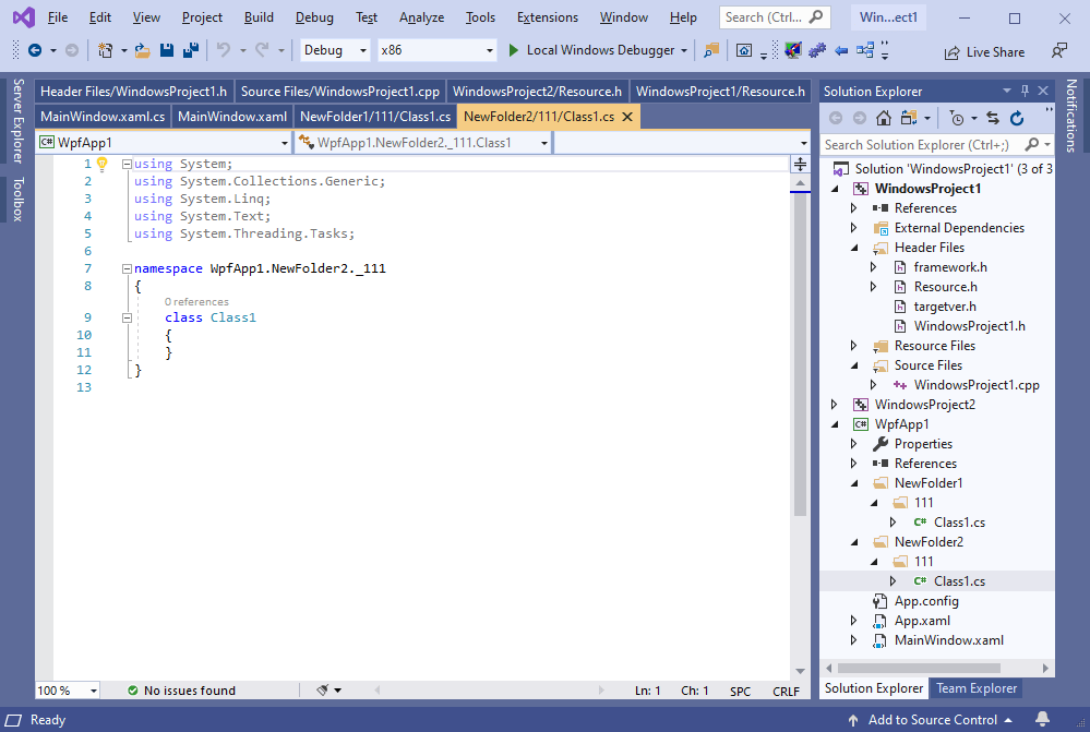
Notice that now the project name is not added to MainWindow.xaml.cs and MainWindow.xaml tabs as they can’t be disambiguated anyway, and two levels of directory names NewFolder1/111 and NewFolder2/111 are added to Class1.cs tabs to make them unique.
Download link: Disambiguator v1.1.0.
Tabs Studio v4.8.0 released:

Download link: Tabs Studio v4.8.0.
Tabs Studio v4.7.3 released:
Download link: Tabs Studio v4.7.3.
Tabs Studio v4.7.1 released:
Download link: Tabs Studio v4.7.1.
Tabs Studio v4.7.0 released:
Download link: Tabs Studio v4.7.0.
Visual Studio 2019 16.4 Preview 2 adds the vertical tabs layout option to the core product:

Tabs Studio continues to work as usual if you keep the tab layout option set to the default Top value, but I’d like to use this opportunity to improve vertical tabs usage experience. More specifically, when vertical tabs are activated in VS 2019, Tabs Studio reuses this area to show tabs, instead of showing them in a separate tool window:
If you want to try it yourself, install Visual Studio Preview.
Enable vertical tabs in Visual Studio options:
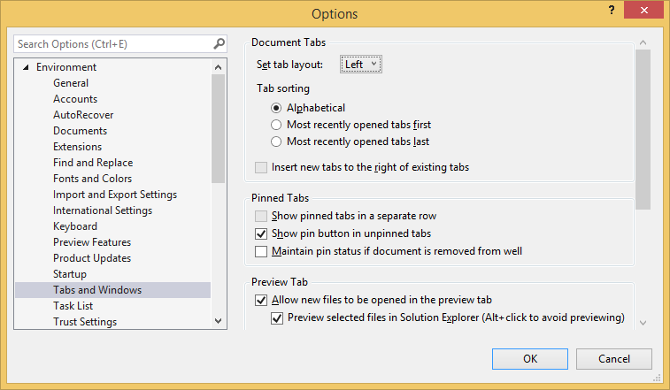
And install Tabs Studio v4.6.2.

 Tabs Studio Blog (organizing Visual Studio document tabs)